PORT ADELAIDE will unveil a celebratory 150th year logo this Sunday, bringing the Power and Magpies together under one emblem for the first time.
However, this is not the first time Port’s logo has changed, and head of the 150th year celebration portadelaidefc.com.au looks back at the different insignias that have represented Port Adelaide throughout its rich history.
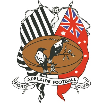
1900s – 1927
This club crest was used from the early 1900s until 1927.
It features a tan football with two magpies on a gum branch, with a black and white striped flag on the left and the Australian Red Ensign on the right.
The red ensign is both significant as it was the flag used and flown by civilians on sea and land, and is the flag flown by the merchant navy and is used prominently on ships in ports around the nation, including Port Adelaide.
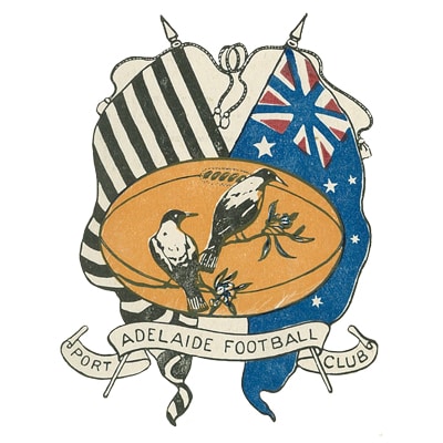
1911 and 1913
A variant of this crest was used interchangeably during the early 1900s featuring a blue ensign rather than the familiar red design.
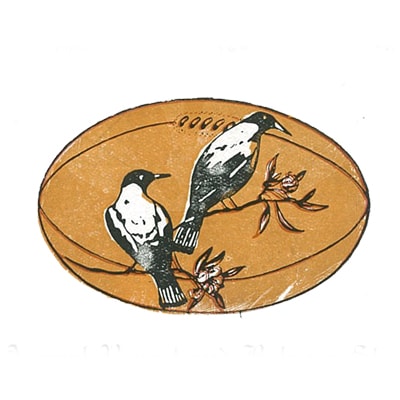
1928 and 1929
For two seasons the club used the two Magpies and ball motif taken from the flagged crest.
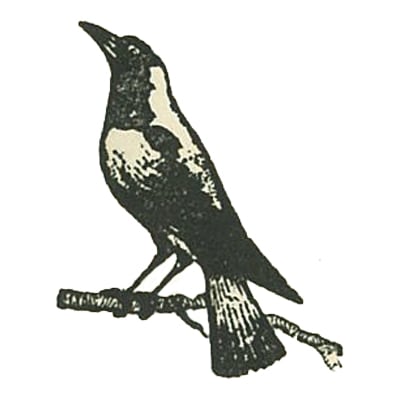
1930 – 1953
The next edition of the logo introduced a dexter facing Magpies (facing left) for the first time, perched upon a gum branch.
This became a unique feature of the Magpies logo that would become so iconic throughout the years - with the Magpie facing the opposite direction to that of other clubs who bore the same moniker.

1954-1974
As Port Adelaide embarked on a national record of six consecutive premierships between 1954 – 59, the club emblem evolved again.
The stance of the Magpies moved closer to that which would become the current day logo and the gum branch on which it was perched became a fence wire.
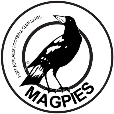
1975-present
The current Magpies logo was introduced in 1975 and proudly represented Port Adelaide for 13 premiership campaigns.
The club adopted a circular disc design and made mention of “Magpies” in the logo for the first time.
This version of the logo is the longest standing in the club’s history running through to the end of the 2019 season.
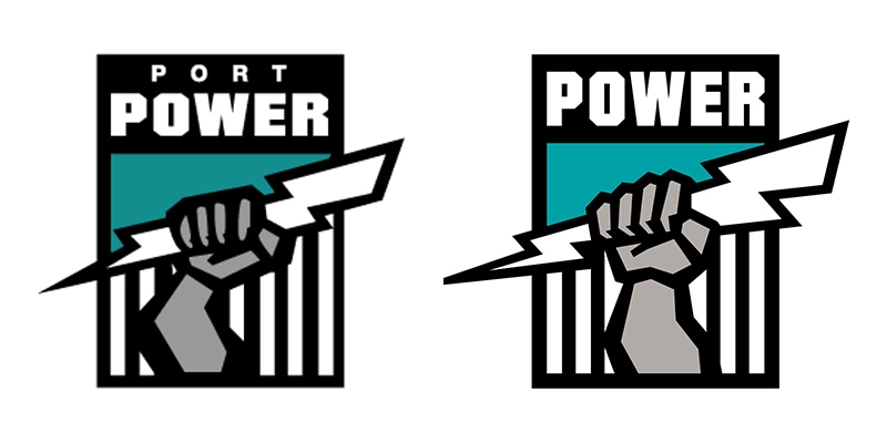
1997- present
Upon entering the AFL in 1997 Port Adelaide adopted the Power moniker, which included taking on the club’s current logo.
It features a silver fist clutching a lightning bolt in front of Port Adelaide’s iconic Prison Bars, while also showcasing the addition of teal to Port’s colour scheme for the first time.
This logo has already been tweaked once. In 2001 the “Port” was dropped from the top of the logo and the design of the fist and lightning bolt defined.
Stay tuned to portadelaidefc.com.au this Sunday for more information about Port Adelaide’s newest club emblem.


